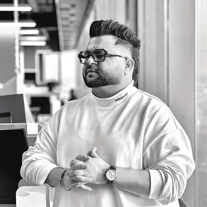
Design Leader — Brand Strategy, Identity & Creative Direction
"I don't just design brands — I write their ethos, find their voice, and build the system that carries both."
I'm a design leader with 10+ years building brands end to end — the thinking and the making. That means I don't stop at logos and layouts: I write positioning, define voice, and set the philosophy a brand runs on, then build the visual system to carry it.
Currently Chief Design & Strategy Officer at NextKid, leading design and brand strategy for a children's smart-product ecosystem. Previously Art Director at Gartner, where I led designers and editors reshaping how research is visualised for enterprise leaders worldwide — and before that, Hettich, NSF International, Trident Group and FRDC. I serve on the Board of Advisors, School of Design, MRIIRS, and hold a Bachelor of Design from NID Ahmedabad with an exchange term at RMIT Melbourne.
Each project below was mine end to end: positioning, ethos and voice, then the identity system that makes it real.
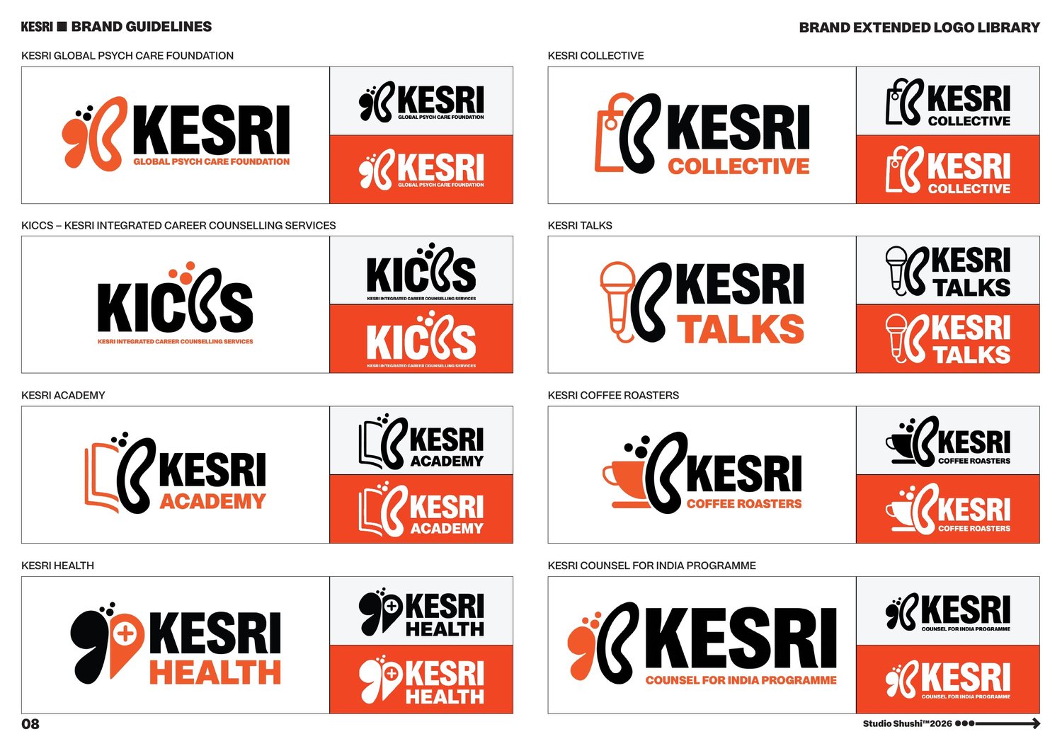
A student-centric mental-health & career-counselling ecosystem for India.
Kesri sits between two failing extremes in Indian education — expensive private therapy and under-resourced schools. I positioned the foundation as a Student-Centric Growth Ecosystem playing two roles at once: Caregiver, offering compassionate mental-health support, and Architect, turning chaotic futures into clear paths through data.
The line I wrote — Empower. Educate. Elevate. — became the spine for everything downstream, from the logo's three ascending dots to the language used across their partner institutions.
The mark reads on several levels: a butterfly in flight for metamorphosis out of struggle, fluid strokes referencing Ik Onkar's "we are all one," and an organic bloom for a student's dormant potential — anchored by a hidden letterform, "K."
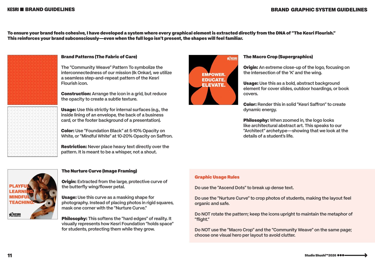
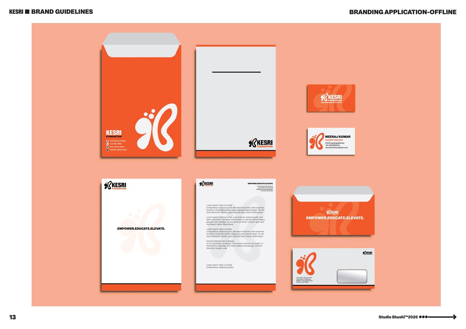
I built the full system around it: an 80/20 saffron-white-black colour law tuned for warmth without losing clinical credibility, an extended logo library covering eight sub-brands sharing one flourish, and a graphic language — a woven pattern, a macro-crop supergraphic, a curved photo mask — all derived from the same shape.
A homemade, zero-compromise Ayurvedic powder brand.
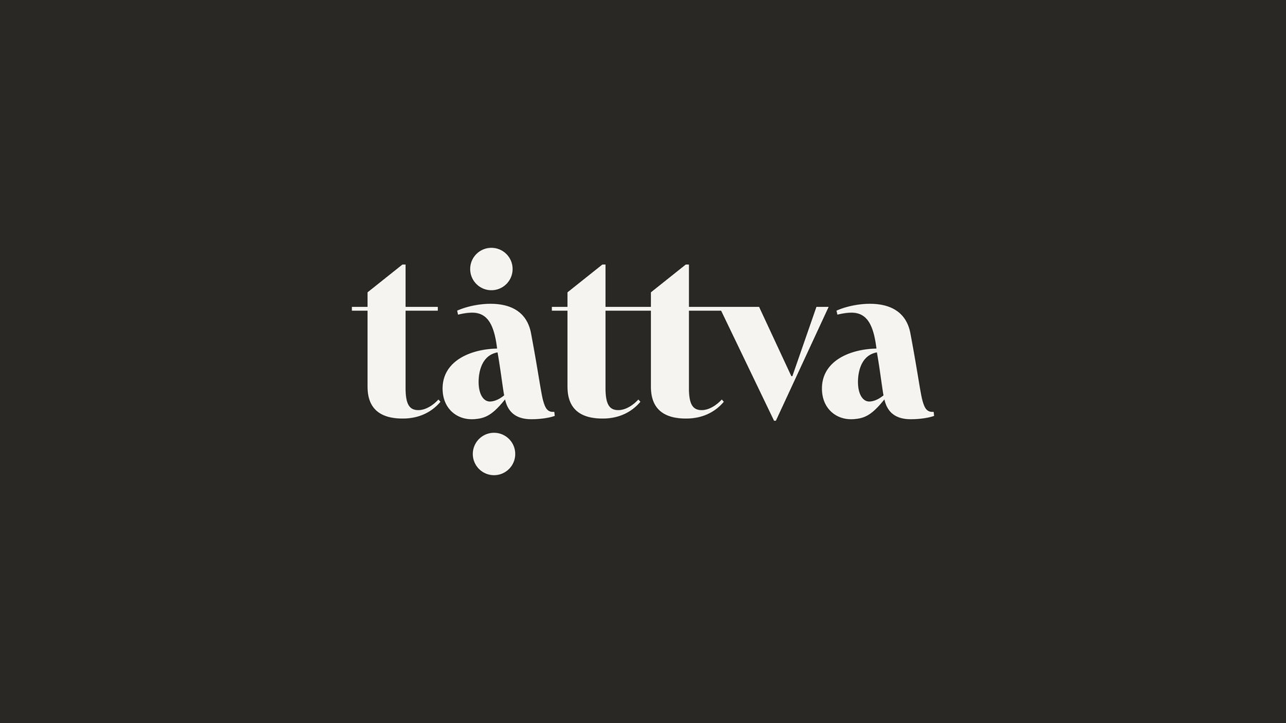
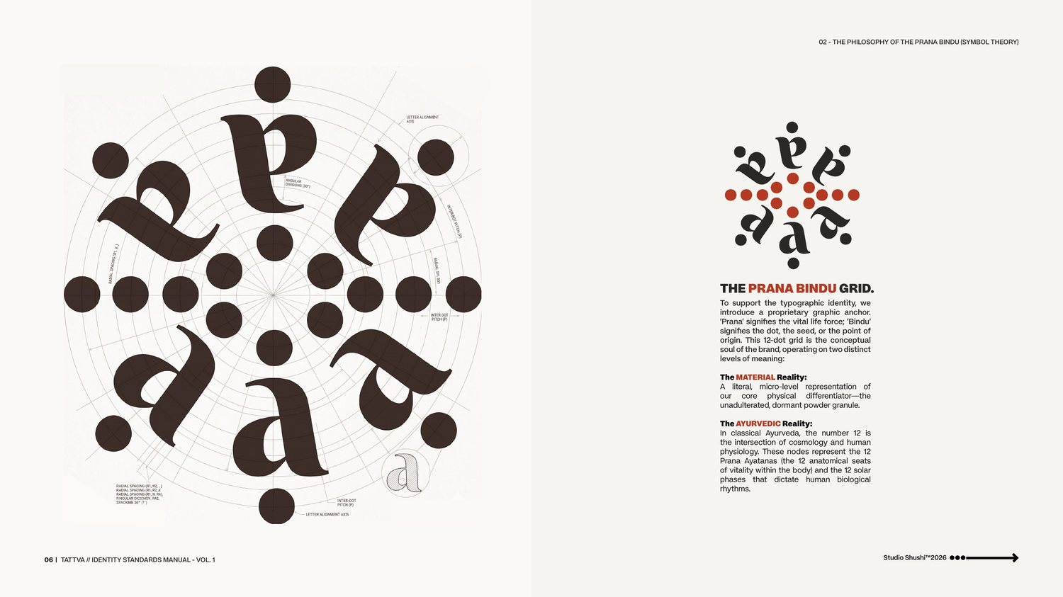
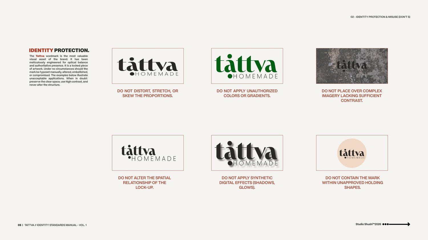
Tattva means "truth" or "the essential element" in Sanskrit, and the brand had to prove that in every choice. I wrote the founding line — zero water, zero binders, zero compromise — and used it as a design test: if a decision didn't serve that reduction, it was cut.
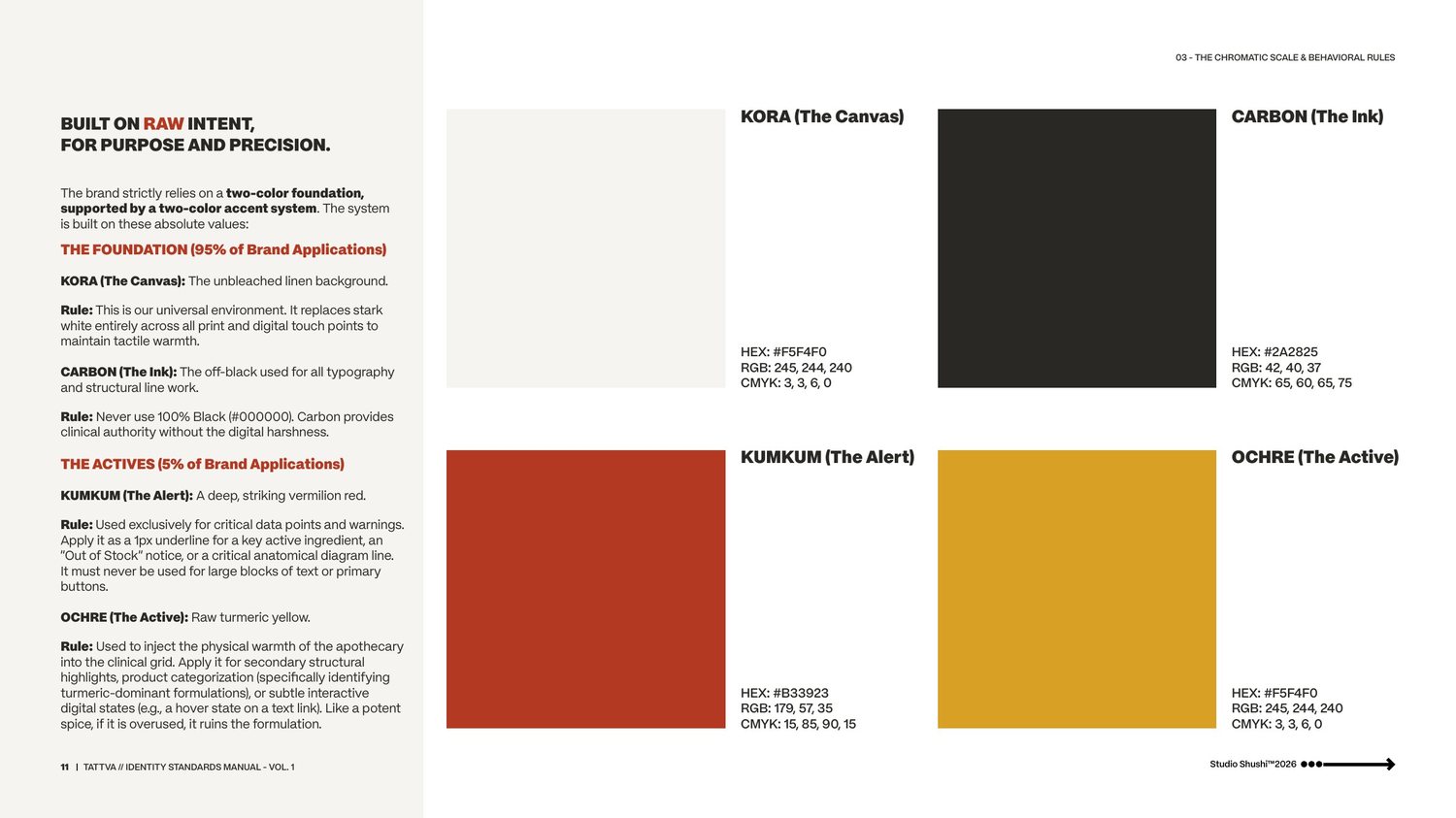
That discipline shaped the lowercase wordmark, which strips away corporate polish for something grounded and natural, and a hard rule against gradients, effects or staged lifestyle photography anywhere in the system.
The wordmark's central lowercase "a" carries a piece of semiotics I call the Axis of Duality — two nodes above and below the letter, one for the rooted self grounded in raw botanicals, one for the elevated self of holistic wellness.
Alongside it sits the Prana Bindu, a proprietary 12-dot hallmark I developed as a secondary sign-off — a literal powder granule at one reading, a map of the Ayurvedic Prana Ayatanas at another — deliberately never locked up with the wordmark, so it stays a quiet detail, not a second logo.
A human-centered technology brand.
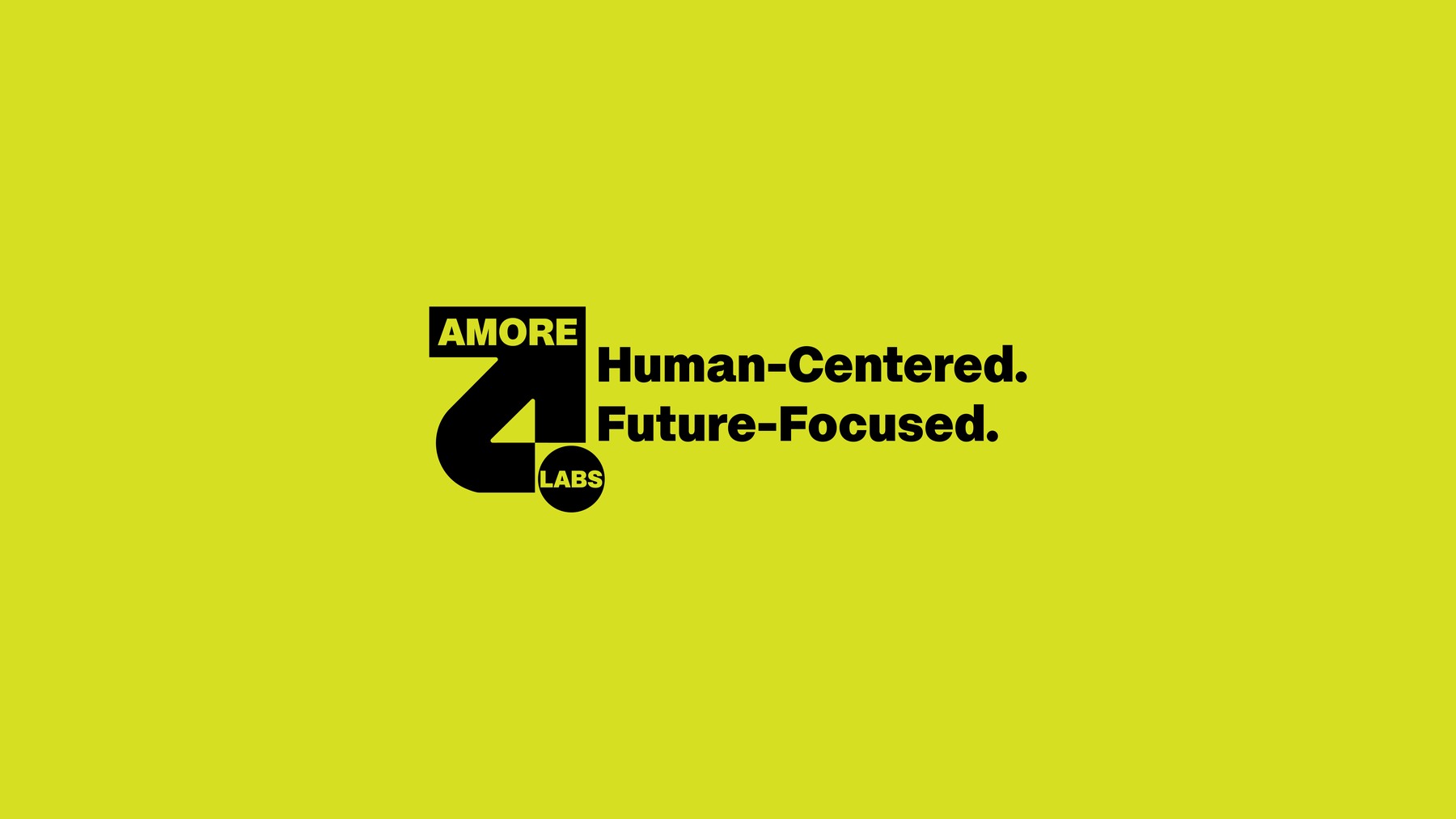
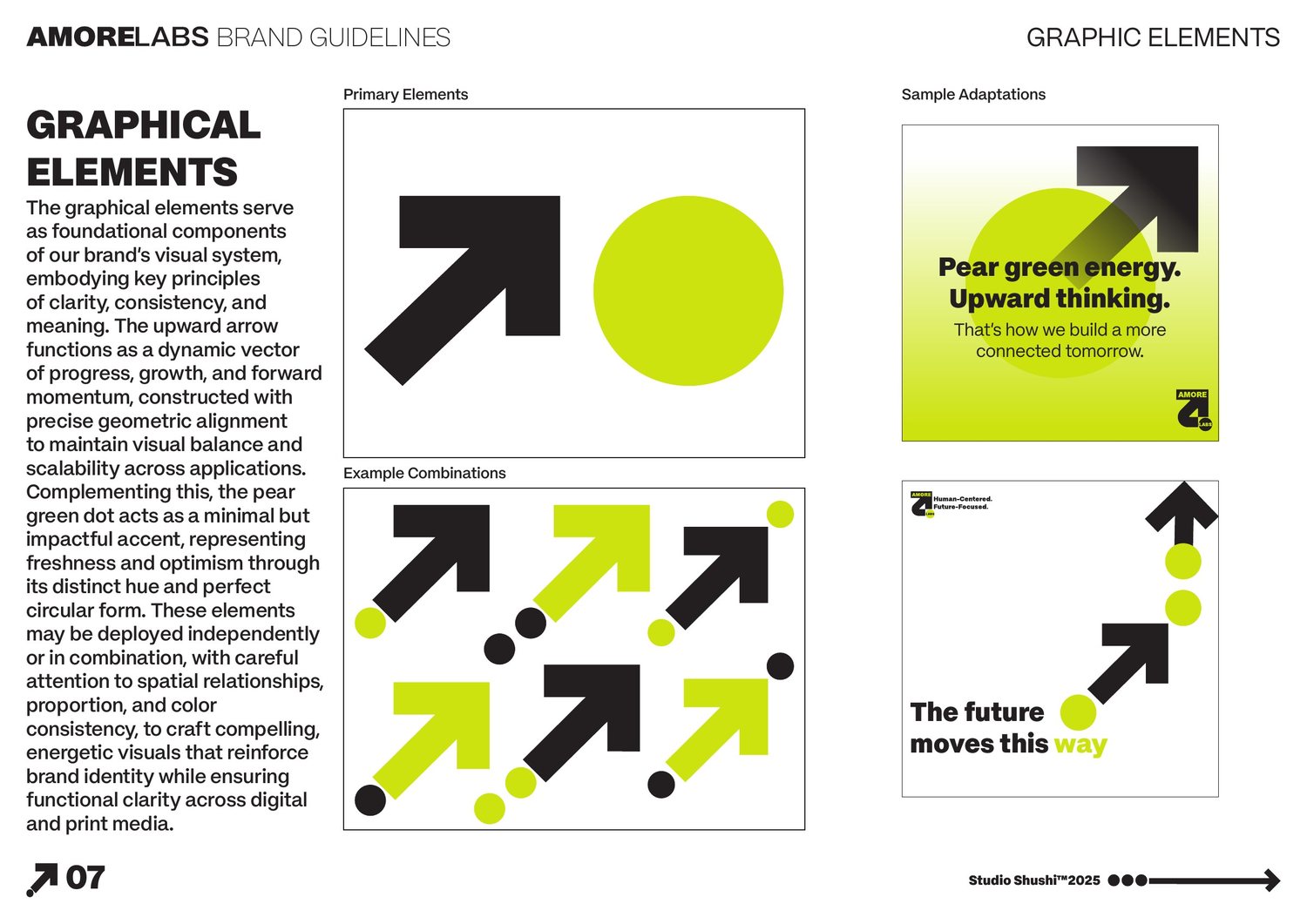
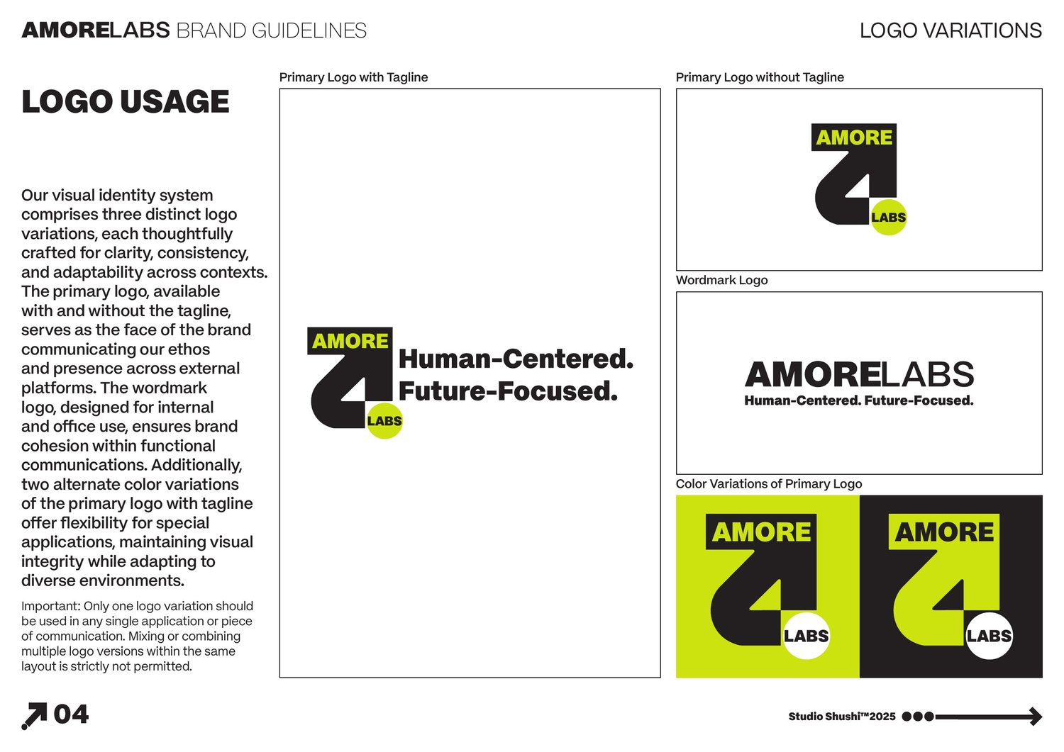
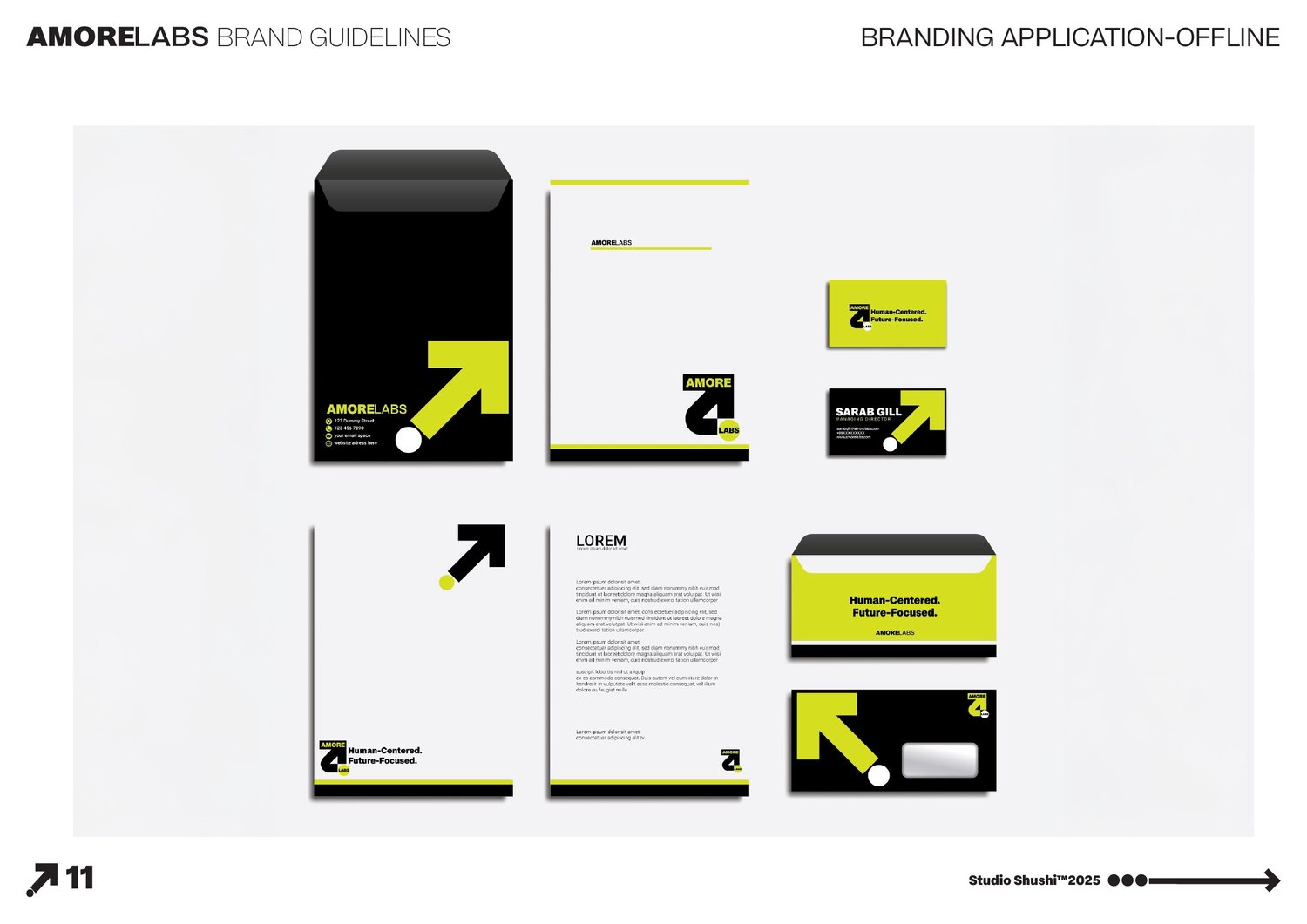
Amore Labs wanted technology that felt like it was designed by people who actually cared, not a lab chasing spec sheets. I wrote the mission around that tension directly — "tech that understands people" — and positioned the brand at the intersection of human-centered design and breakthrough innovation, built to reach and empower as many people as possible.
The mark is a small piece of logic: a dot for balance between technology and empathy, an upward arrow for progress — together forming a hidden "A." I built a triadic pear-green, white and black system around it, and developed a graphic language flexible enough to carry a line like "Pear green energy. Upward thinking" across everything from social templates to stationery, plus an icon law of strict square geometry with zero rounding — functional only, never decorative.
A holistic children's brand for screen-free smart toys.
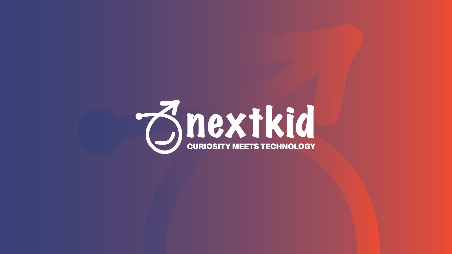
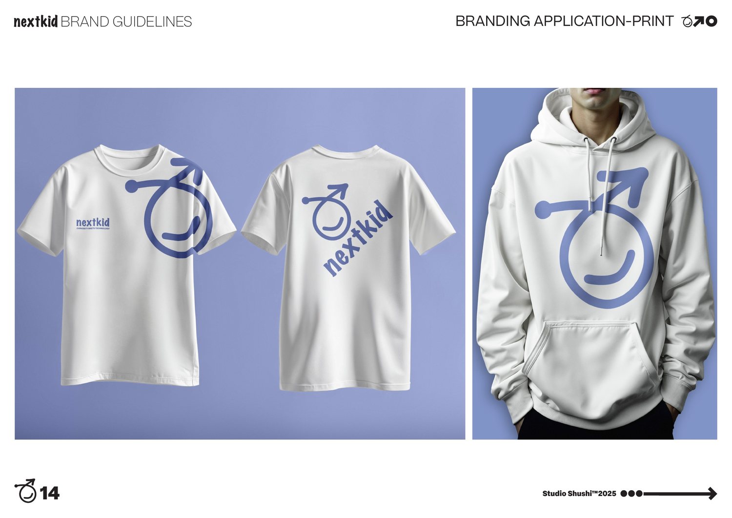
NextKid needed to hold two ideas that usually pull apart — real technology and genuine childhood play — without reading as either an EdTech product or a toy. I positioned the brand around "curiosity meets technology," built to support a child's growth across every dimension: intellectual, emotional, social and creative.
I built the full brand voice and visual system from zero: naming direction, tone, and the identity that carries it across product, digital and print.
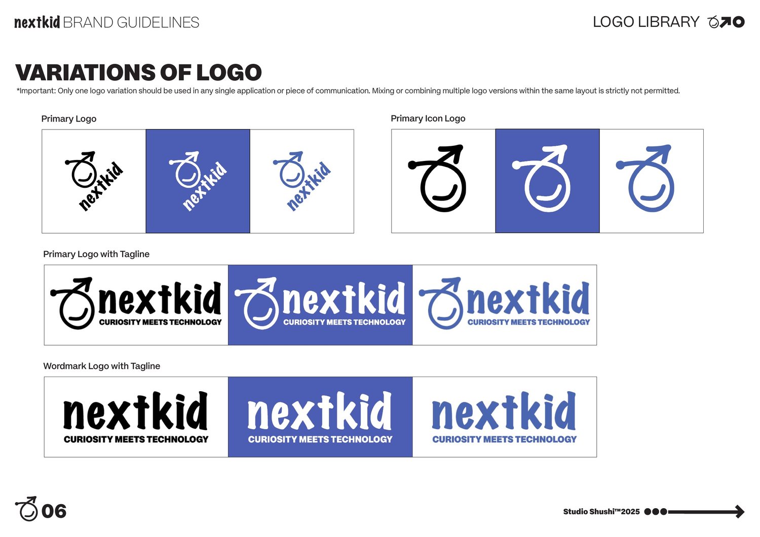
The mark is a single unbroken line — the same spontaneous stroke a child draws in one go — starting at a launch-point dot and rising into a smiling face, so growth and warmth are built into the logo's construction, not layered on top of it.
I set Discovery Violet against white as the calm, curious base of the palette, reserved a violet-to-red gradient for high-energy moments, and built a hand-drawn icon and graphic system so every touchpoint felt drawn by the same hand.
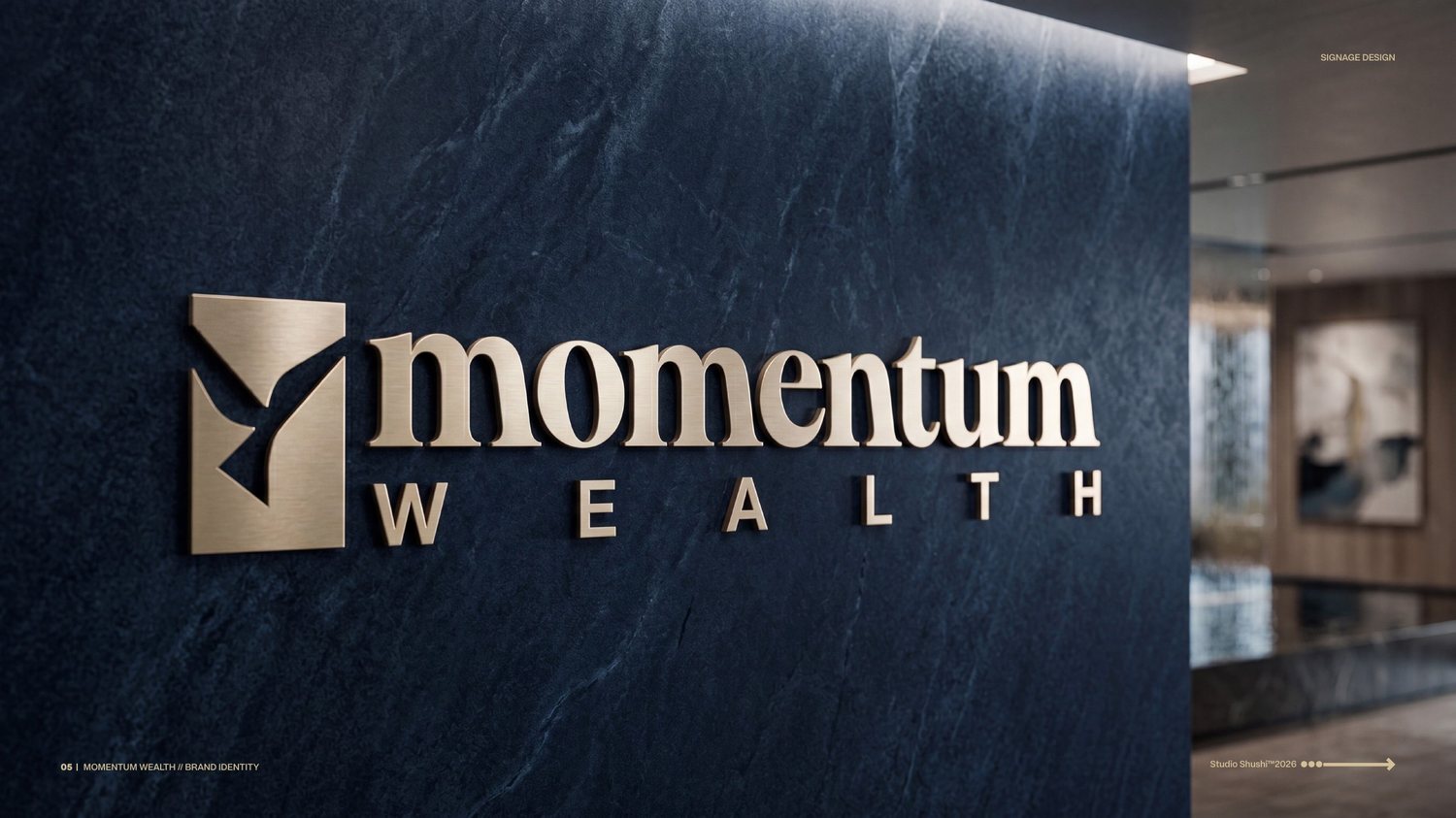
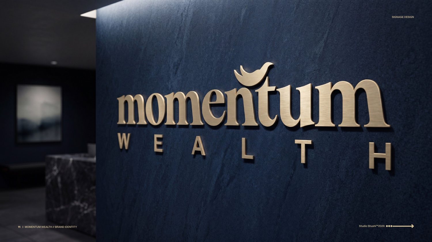
Two concept directions for a private wealth advisory firm.
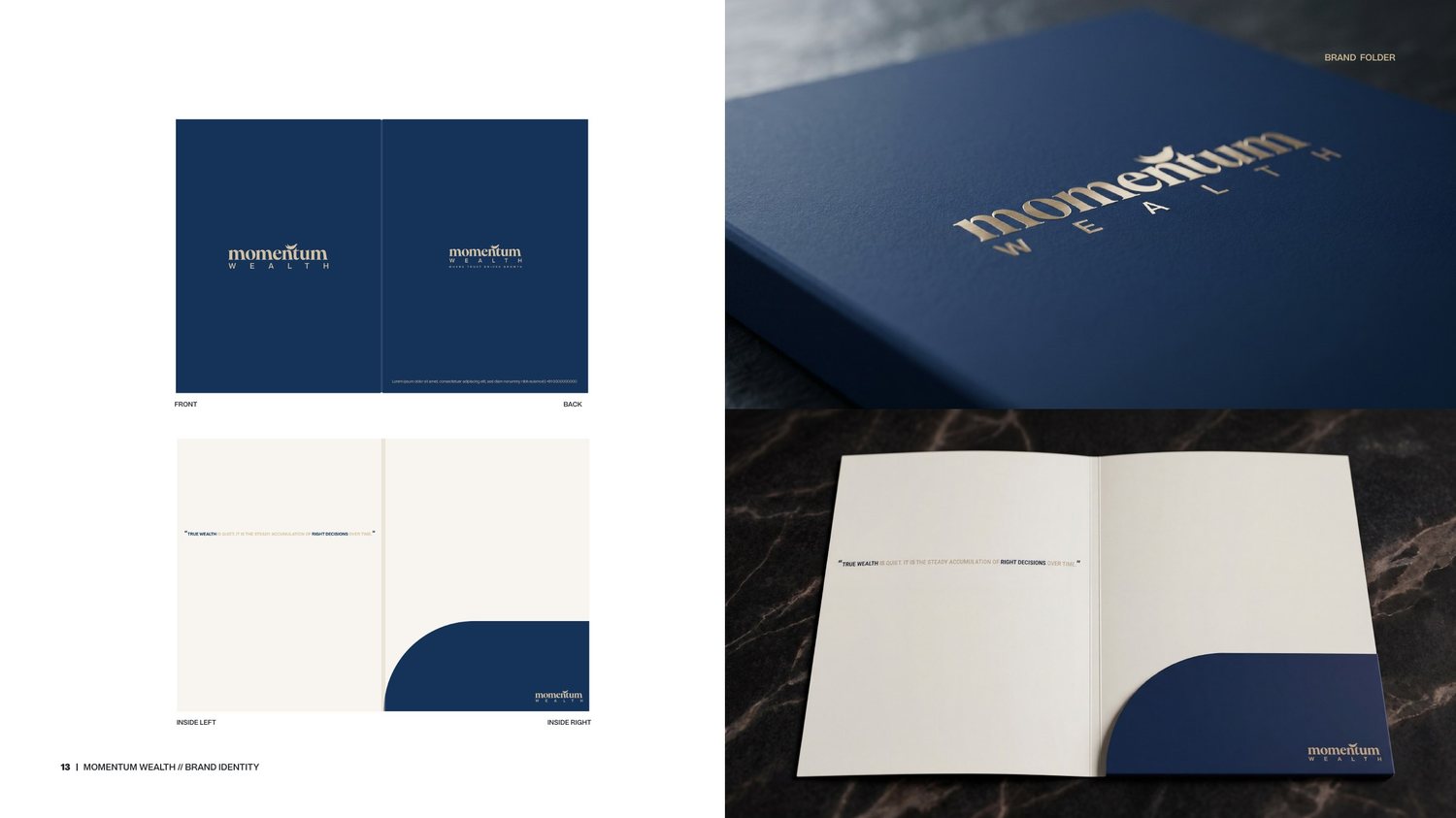
The ethos is in the brief I wrote for it: generational wealth isn't built through erratic, short-term velocity — it's engineered through deliberate, ascendant momentum. I designed the identity to read with high-altitude perspective, unwavering stability and effortless foresight, built for a private advisory firm serving ultra-high-net-worth clients, not a retail bank.
Rather than one direction, I developed two full concepts for the client to choose between. The Vanguard Block carves an ascending eagle out of a solid navy monogram — a self-contained icon engineered to work as a blind-debossed wax seal, a lapel pin or an app icon on its own. The Typographic Canopy takes the opposite approach: no separate icon at all, just a bespoke eagle woven directly into custom-cut lettering, so the wordmark alone feels like a private-foundry typeface cut for one firm.
"True wealth is quiet. It is the steady accumulation of right decisions over time."
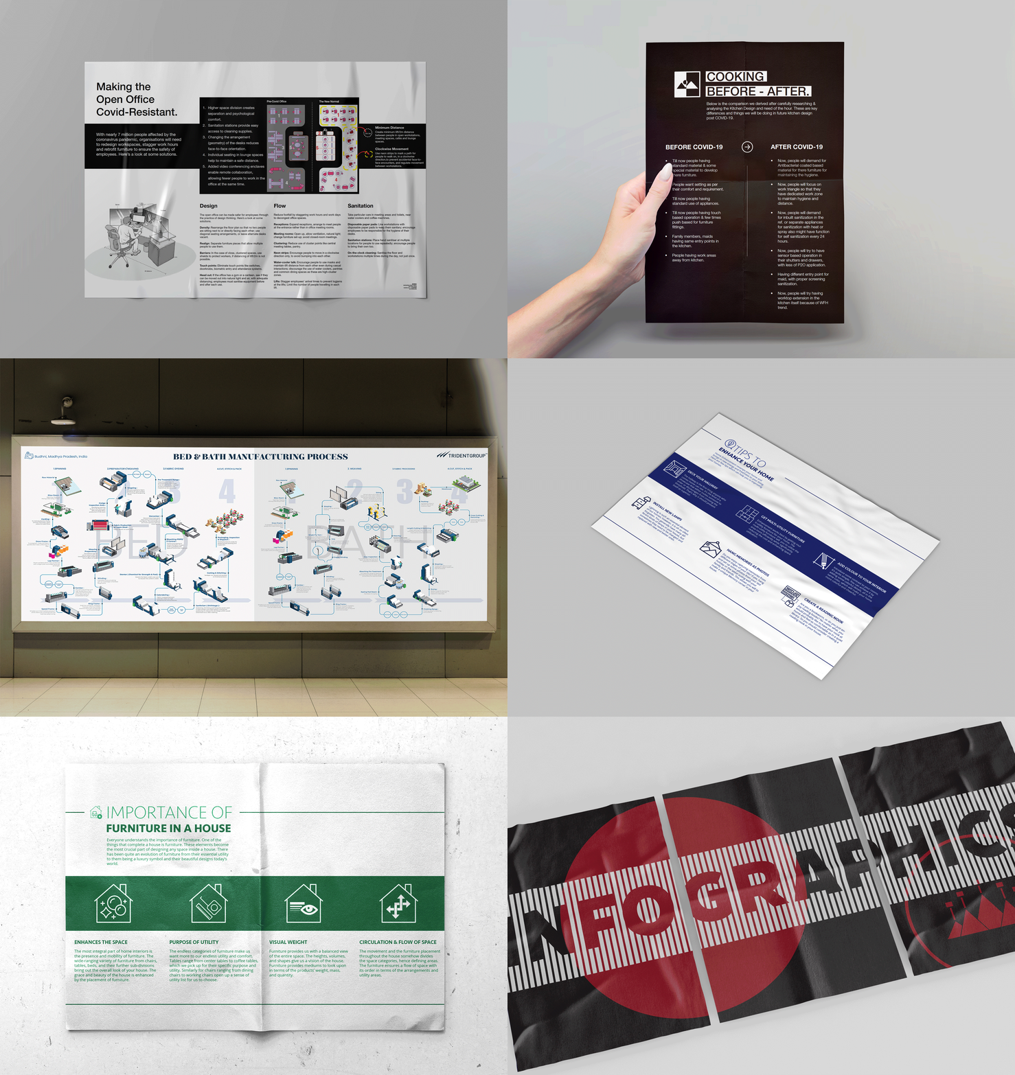
Selected pieces from earlier in my career — retail, exhibition and campaign work across FRDC, Trident Group and Brewed Media.
Advisory board alongside design leaders from Honda and Sonalika, shaping curriculum and strategy since 2024 — including coursework on generative AI in design practice.
Every role, dated, with the detail the case studies above don't cover.